Reach Out
“ReachOut is a social impact employment app designed to support formerly incarcerated individuals by connecting them to tailored job opportunities through AI-driven matches, fostering second-chance hiring and societal reintegration.”
Introduction
At ReachOut, we are building an innovative application to tackle the pressing challenge of reintegration for individuals impacted by incarceration. Our mission is to create meaningful pathways to employment, empower individuals in their transition back into society, and reduce recidivism by fostering opportunity and support.
The app leverages artificial intelligence to connect users with job opportunities tailored to their unique skills and experiences. By providing personalized recommendations and seamless access to resources, ReachOut bridges the gap between individuals seeking employment and organizations committed to second-chance hiring.
In collaboration with forward-thinking employers and community partners, ReachOut goes beyond job placement to instill confidence and equip users with the tools needed to rebuild their lives and contribute positively to their communities.
This project embodies our commitment to inclusivity and social impact, working toward a future where everyone has the opportunity to thrive.
Date
September-December 2024
Role
UI/UX Designer
Frontend Developer
Research Analyst
Skills
User Research
Javascript
Tailwind CSS
TypeScript
Next.js / React
Figma
Problem Statement
Individuals impacted by incarceration face significant challenges in reintegrating into society, including limited access to employment opportunities, social stigma, and a lack of resources tailored to their unique needs. These barriers not only hinder personal growth and financial stability but also contribute to higher rates of recidivism, perpetuating cycles of disadvantage. Employers, on the other hand, often struggle to find and connect with skilled individuals willing to contribute meaningfully, particularly within second-chance hiring initiatives. There is a critical need for a solution that bridges this gap, empowering individuals to rebuild their lives while enabling organizations to embrace more inclusive hiring practices.
User Flow
Explore the structured journey users take through ReachOut, from onboarding to job application, with an interactive user flow diagram.

Competitor Analysis
Indeed
A global job search platform that connects employers with job seekers, offering tools for job postings, resume uploads, and company reviews.
Features:
- →
Job Search Functionality: Both platforms allow users to search for jobs tailored to their skills and preferences.
- →
Resume Uploads: Users can upload or create resumes to share with potential employers.
- →
Application Tracking: A feature to track job applications and statuses.

Indeed
User Research Findings
Explore our research insights on job-seeking challenges and solutions for ex-offenders.
User Personas
Gain insights into our detailed user personas, representing the key stakeholders and their unique challenges, motivations, and behaviors in the job-seeking process.
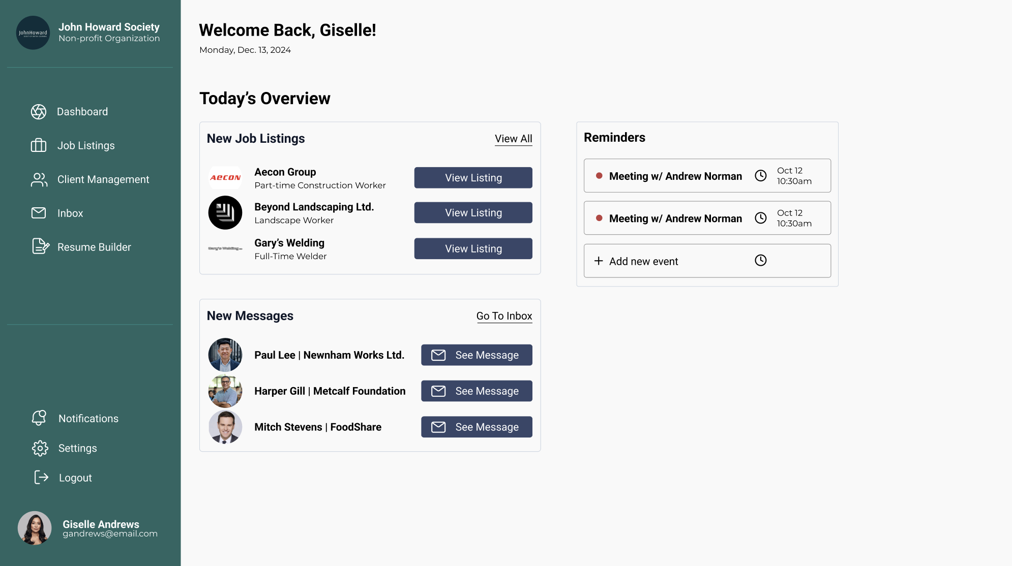
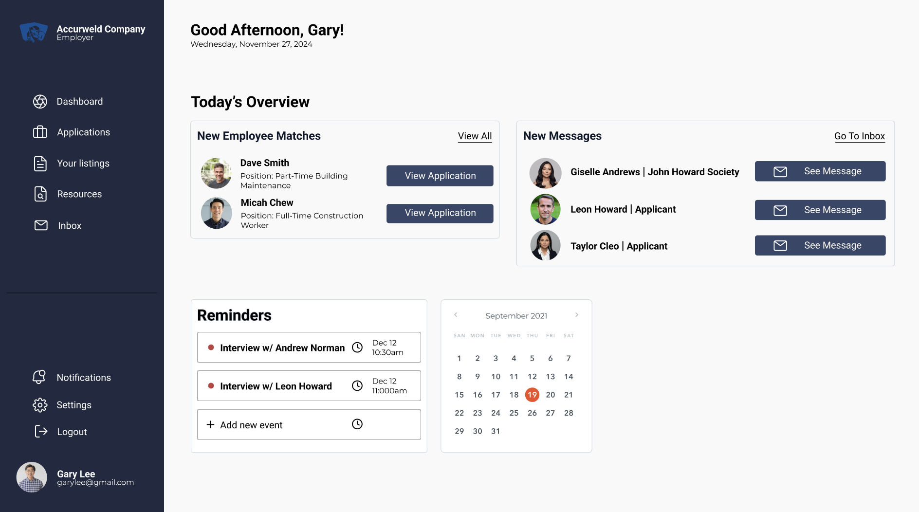
Interface and Design Choices
- 1.Welcoming Hero Section:The homepage features a bold, inviting statement and a call-to-action button ("Get Started Now!") that encourages immediate user engagement. It’s complemented by an image showcasing collaboration and trust.
- 2.Clean Layout:A clean, structured design with clearly separated sections, such as "Progress Tracking" and "Resource Database," ensures users can easily find what they need.
- 3.Consistent Color Scheme:The calming green and neutral grey palette communicates trust and professionalism while providing visual appeal.
- 4.Impact Highlights:Metrics like "2000+ job seekers placed" and "500+ nonprofit organizations engaged" build credibility and reinforce the platform's effectiveness.
- 5.Interactive Features:Progress tracking, personalized job matching, and intuitive buttons like "View Progress" enhance usability and functionality.
- 6.Success Stories:A dynamic carousel of testimonials highlights real-life examples of the platform’s success, creating an emotional connection.
Compare ReachOut Employer & Organization PDFs
Drag the slider to compare the two images:

Hero Section Design
Interface + Design Choice


Mockup Presentation
Design Choice

Color Palette
Design Choice

Impact Metrics
Interface

Feature Highlights
Interface

Storytelling
Design Choice
Challenges
- 1.Welcoming Hero Section:Making the statement and call-to-action visually striking while ensuring the hero image conveys collaboration.
- 2.Clean Layout:Designing intuitive, distinct sections that remain responsive and uncluttered.
- 3.Consistent Color Scheme:Balancing the palette for appeal, accessibility, and cohesive branding.
- 4.Impact Highlights:Presenting metrics dynamically without overwhelming users.
- 5.Interactive Features:Ensuring progress tracking and job matching are functional, intuitive, and responsive.
- 6.Success Stories:Creating a seamless carousel that feels engaging and authentic across all devices.
Solutions
- 1.Welcoming Hero Section:To make the hero section both engaging and effective, we designed it with a bold, clear call-to-action and a powerful visual that communicates trust and inclusivity. The messaging was carefully crafted to immediately capture user interest, and the layout ensures that key elements—such as the CTA button—are easy to find and interact with.
- 2.Clean Layout:The interface was structured with a focus on clarity and ease of navigation. Sections were distinctly separated, and whitespace was utilized effectively to prevent clutter. Responsive design principles were applied to maintain consistency across different screen sizes, ensuring an intuitive experience for all users.
- 3.Consistent Color Scheme:We carefully selected a calming yet professional color palette that aligns with ReachOut’s mission. The colors were tested for accessibility, ensuring high contrast for readability and an overall sense of trustworthiness. The design follows brand identity principles while being inclusive for users with visual impairments.
- 4.Impact Highlights:Key statistics such as "2000+ job seekers placed" and "500+ nonprofit organizations engaged" were integrated into the interface to provide credibility. The data visualization was designed to be digestible, balancing informative elements with aesthetic appeal. By placing these metrics strategically, users can quickly grasp the impact of the platform.
- 5.Interactive Features:The job-matching process was enhanced with AI-powered recommendations, providing personalized job suggestions based on user profiles. A user-friendly dashboard was implemented for progress tracking, ensuring that individuals can monitor their applications and career development effectively.
- 6.Success Stories:To humanize the platform and build trust, we incorporated a dynamic testimonial carousel. This section highlights real-life stories from individuals who successfully transitioned into employment through ReachOut. The design ensures smooth transitions between stories, keeping users engaged without overwhelming them with excessive content.
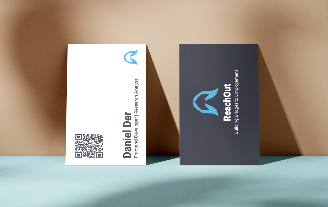
Business Cards
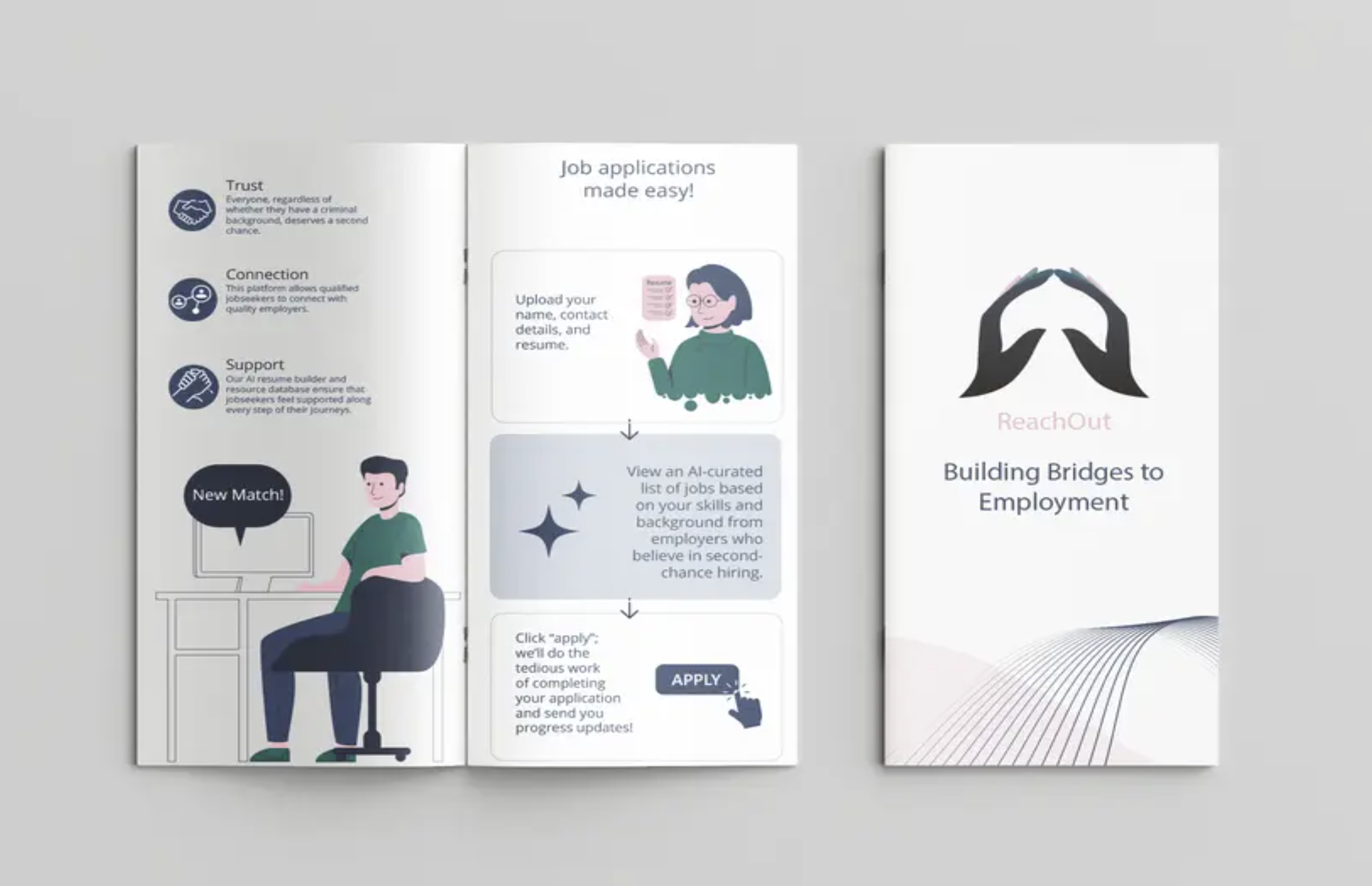
Brochure